NIHON KOHDEN
BRAND FOUNDATION / GUIDELINES / CAMPAIGN
Resuscitate a sleepy category.
Nihon Kohden has a 70-year history of inventing the medical tech synonymous with modern healthcare. But over the decades, they’ve lost market share and name recognition to global competition. While Nihon Kohden builds strong products, our challenge was to help them rebuild the brand.
TEAM
CD / AD: Matt Graff
CD / CW: Mark Lewman
AD: Jay Floyd
Design: Mark Lepper
Speak like a human.
B2B communications don't need to be dry, stuffy or robotic. Businesses are powered by humans, after all. So we took a B2C approach, using a warm, personal tone to tell exciting, human-centered stories grabbed our audience’s attention and stood out in the category.
Stand out in a sea of (healthcare) blue.
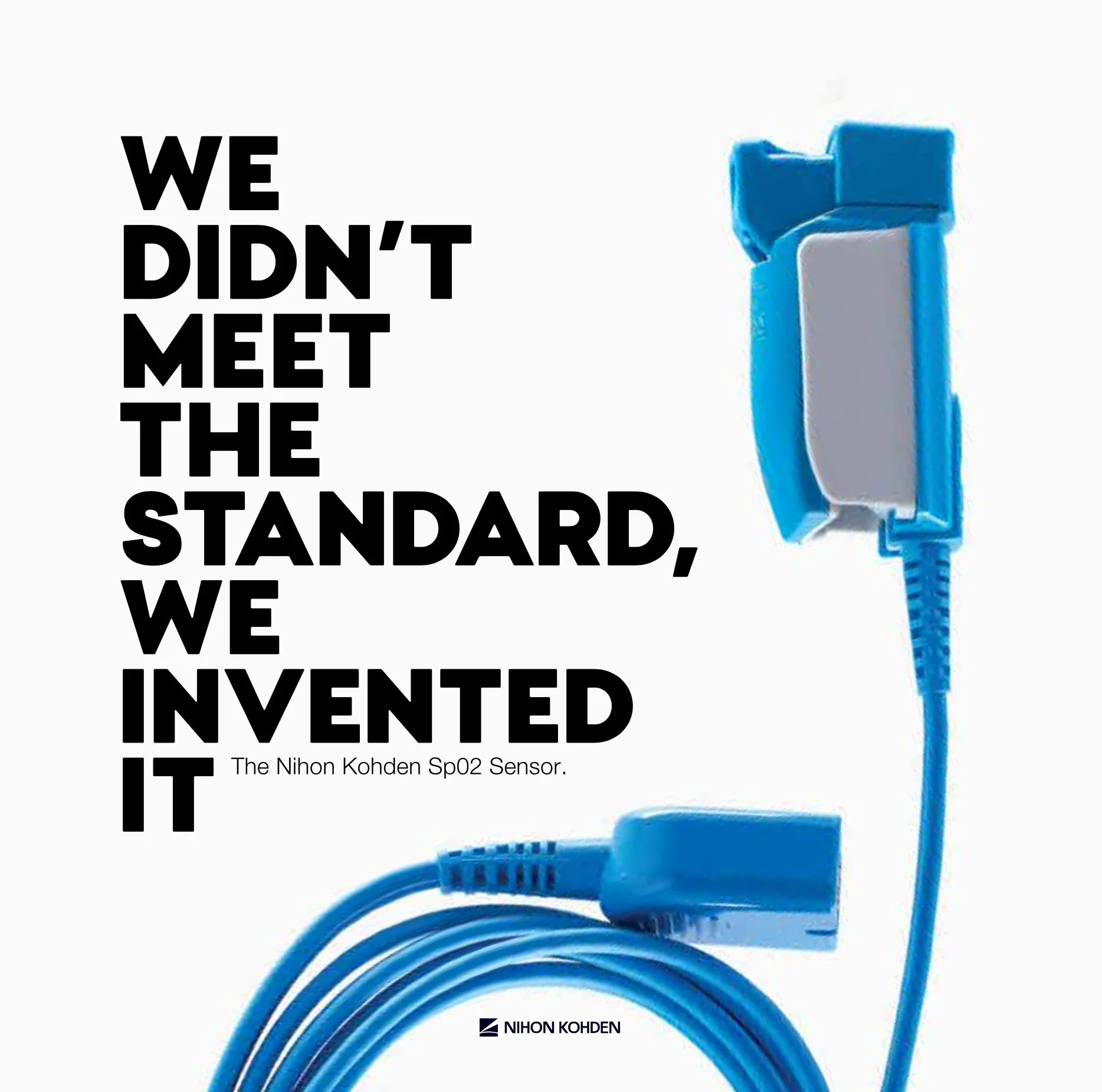
Gone are the days of bad stock photography, outdated graphic-design conventions and rambling, emotionless copy. We created a bright and inspiring visual identity and tone of voice, and then brought it through bold, benefit-driven stories inspired by the brand’s commitment to positive patient outcomes.
Industry Audit – “Healthcare Blue”
Previous Nihon Kohden Brand Expression
Empower a sales team
Nihon Kohden sales reps were trained to sell the product specs, not hit their audience in the heart with emotion-driven benefits. Our team identified opportunities in the sales process and created tools for the reps to talk about what matters to their audience: improved patient outcomes, year-over-year profits, long-term value and tangible proof of how the technology elevates their practice and simplifies their workflows.


